by Mário Braga
Heads-up
The trend
Inflation in Brazil has gone through sharp variations over the past couple of years. The changes follow a long period when a higher level of price increases was tolerated - not to say encouraged - by the federal government. It was all part of a strategy to rely on a heated consumption market to boost the local economy.
It is a supply and demand logic. When a country's economy is growing, more people have jobs, wages normally go up, and consumers are more willing to spend. With a high level of demand, suppliers can increase prices and still find people to pay for the products or services they offer. That is true for the local bakery and the hairdresser around the corner but also for the car manufacturer and the telecom provider.
When that happens, and the overall level of prices increases, inflation goes up. In a recession, things work the other way around. The chart below illustrates the ups and downs of Brazil's consumer price index.
In 2018, the IPCA benchmark index ended at 3.75%, the second lowest reading in 12 years. Prices are increasing at a slow pace because the economy is still recovering from its worst recession in history and unemployment remains high. But looking back, the chart makes it clear how Brazil has struggled to keep its price dynamics under control.
An effective way to assess that is by comparing how the actual rates fit the so-called inflation target system. In Brazil, such a framework was adopted in 1999. In short, it sets a goal for price increases. The Central Bank is the institution in charge of keeping prices at the desired level. To do so, it uses monetary policy instruments - namely hikes or cuts in interest rates.
The mechanism works similarly to the supply and demand logic. Higher interest rates make it more expensive to finance a car or get a loan to build a new factory. Therefore, it is likely that consumers and investors will postpone their plans. With fewer people willing to spend, shops and factories will have to avoid charging more their clients so they can prevent stocks piling up. In other words, when a Central Bank raises interest rates, the general level of prices is likely to go up at a slower pace, meaning that inflation will be lower.
The target system
Currently, 28 countries adopt inflation targeting, according to the International Monetary Fund. Its main goal is to provide economic stability. Therefore, a country does not necessarily have to hit the target every single year but should make sure it does not miss by much. That gives a comfortable level of predictability to the economic agents, either buyers or sellers, to plan their budgets for the upcoming months.
In Brazil, the system sets a central target and with a margin of tolerance around it. Back when it started, in 1999, the objective was to keep annual inflation at 8%. Between 2005 and 2018, the target was at 4.5%.
In the past couple of years, Brazil's National Monetary Committee decided to reduce the tolerance band from 2 to 1.5 percentage points. From 2019 onwards, it has also lowered the central target itself in 0.25 percentage point per year. Therefore, inflation is expected to end 2021 around 3.75%.
But it is noteworthy that such figures refer to an average of the country. When analysed in detail, inflation can have different trends, shapes and values.
A closer look
Different cities, different prices
One way to breakdown the numbers is looking at how inflation has behaved in different cities. In Brazil, the national statistics agency, IBGE, has compiled data on nine major metropolitan areas since 2012.
Although the major trend is the same - relative stability from 2012 to 2014, a peak in 2015 and a decline afterwards -, it is possible to identify contrasting behaviours when it comes to price dynamics across the country.
The reason why that is so is that each metropolitan area has some unique economic features. Unemployment has been historically higher in Salvador than in the rest of the country, for instance. On the other hand, São Paulo's economy accounts for over 10% of the national Gross Domestic Product. The city has one of the highest living costs in Brazil. Wealthy "paulistanos," as the locals are called, can spend small fortunes in rents, casual dining, and private education.
This shows that to calculate inflation it is necessary to go beyond the price variation itself. It is also necessary to take into account what people usually buy and how much of their budget a given item takes.
That is why the IBGE has a structured methodology to collect all the information needed to find the price increase rate for the country. A crucial step is establishing a standard basket of goods that the average Brazilian consumes.
What makes up the IPCA index, after all?
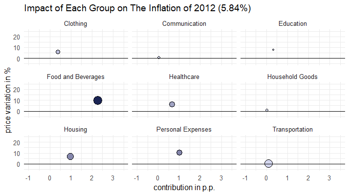
The first level in which this information is organized is by what the statistics agency calls "Groups." The methodology used to calculate the IPCA divides services and goods into nine broad categories: Food and Beverages, Transportation, Housing, Healthcare, Personal Expenses, Education, Household Goods, Clothing and Communication.
The chart below shows how each of these groups contributed to the 2018 inflation in Brazil. The position in the vertical y-axis indicates the price variation of the products of a given group. The size of the circle illustrates the weight each group has in the composition of the index. That is, how much of people's budgets go to the items from that category. The combination of these two pieces of information results in the actual contribution of that group to the annual inflation rate. This figure is represented by the position of each circle in the horizontal x-axis. The sum of the contribution of all nine groups results in the actual inflation rate.
Note how the prices in Food and Beverages and Healthcare rose by around 4% last year. However, since people spend money more regularly and in bigger amounts with meals than with drugs, the circles have different sizes. As a result, the impact of the group Food and Beverages to the IPCA is more significant.
In contrast, the portions of Brazilians' budgets that go into cellphones and internet or clothes and shoes is so small, that regardless of the fluctuation of prices in these groups, their contribution to the annual rate is likely to be low.
Different groups, different impacts
The bar chart below breaks down the 3.75% inflation rate of 2018 and shows which groups were the main responsible for the overall increase in prices. The top three "villains" were Food and Beverages, which accounted alone for 26.3% of the annual inflation, and Transportation and Housing, with around one-fifth of the rate each.
On the other hand, the price fluctuations of the Clothing group represented less than 1% of the total rate, while a drop in prices in the Communication category helped to bring inflation down - but merely by 0.08%.
Changes throughout the years
As consumption habits change, so does the composition of the IPCA. The statistics agency updates the index every year so the data reflects the reality in the closest way possible. Although the changes do not mean drastic shifts, they do make a difference. For instance, from 2012 to 2018, the importance of the Food and Beverage group in the overall basket of goods increased from 23.1% to 25.7%, while Communication's weight dropped from 5.9% to 3.6%.
As prices also fluctuate at different rates as years go by, the contribution of each group is constantly changing. Events such the burst of a housing bubble, severe weather conditions affecting the production of vegetables or even government decisions to charge more for gas or urban bus fares have an impact on the results of the IPCA.
Here you see how the contribution from the same nine groups varied between 2013 and 2018.
This scatter plot helps to tell the same story about the price dynamics the first line chart did but from a different angle. The way the circles are more spread in 2015 explain why inflation hit 10.67% that year. Conversely, in 2017, they are mostly clustered and much closer to the x-axis, showing the increase in prices was lower and thus, the inflation rate that year was 2.95% - the first time during the targeting system in which the rate ended a year below the bottom band limit.
By isolating the price changes of each category, it is easier to observe how their impact changes each year. In groups with low weights, such as Clothing, Communication, Education and Household Goods, it does not make much difference how more or less expensive things are. Their importance in the composition of the index measured by their weight is so small, that no matter how much up or down the circles move, their position in the horizontal axis is almost the same, because their impact in the overall index is limited.
On the other hand, since Food and Beverages, Housing and Transportation account for nearly half of the IPCA, the changes in prices represented by the movement in the vertical axis result in more significant movements in the horizontal range. In other words, the cheaper or the more expensive products from these three groups get, the more likely the IPCA is to follow the trend either up or down.
Here you can see how dynamic those changes are and how the shifts of the bigger circles representing the groups with bigger weights drive the annual rates up and down throughout the years. The colour shows how strong was the contribution of a given group to the inflation in the period ranging from 2012 to 2018. The darker the tone of blue the higher the impact on the price increase.
Diving deeper
Item by Item
A more detailed way to analyse the same pattern is looking at the products that are part of each group. IBGE breaks down the composition of the IPCA into 52 items.
Here you see the price variation and the contribution of each of them to the same 3.75% inflation rate recorded in 2018.
Note that despite leading the price increases with a 38% rise, roots and vegetables have a relatively smaller weight than other items and therefore, it is not the main contributor to the annual inflation.
Also, although Food and Beverages leads the ranking as a group since it is composed by 17 items, their contribution is more evenly spread than among the fewer items that make up the Healthcare, Transportation and Housing categories.
The top ten contributors listed below account for 72.1% of the final 3.75% rate of 2018. Their combined impact results in an inflation of 2.74%. The remaining 1.01 percentage point is spread among the other 35 items that got more expensive in 2018.
At the bottom of the list, seven items recorded drop in prices and had a negative impact on the IPCA. Combined, they represented -0.26 percentage point to the final calculation of the 3.75% rate.
In sum, different items take different shares of the average Brazilian's budget, have distinct prince increases or decreases by the end of the year and therefore result in unique effects on the overall inflation rate.
Since different people buy different products, it is time for you to find you your inflation.